The "Content structure" tab
The "Content structure" tab allows the user to browse and manage the nodes that belong to the "Content" top level node. This is the part that makes up the actual structure of the site. It may contain menu items, folders, articles, comments, products, forum messages and so on.
The following screenshot shows the administration interface when the "Content structure" tab is selected.

The Content Structure Tab
The interface consists of two parts: a left menu and a main area with multiple windows.
The left menu
The left menu will display an interactive tree containing the nodes that belong to the "Content" top level node. In addition, it also provides access to the trash. The window will automatically adjust itself depending on the height of the tree that is being displayed.
The following screenshot shows the left tree menu.

Content Structure Left Menu
The tree menu in eZ Publish behaves very much in the same way as the interface of a typical file browser in a modern operating system. It allows the user to view and explore the depths of the content tree by expanding the different nodes. This can be done using the small +/- buttons that are located on the left hand side of the icons. A missing +/- means that a node does not have any children and thus it can not be explored. If the target browser does not support JavaScript or if JavaScript support is disabled, the tree will be displayed as a static HTML list. In this case, the tree will be fully expanded at all times.
Note: The left menu is not always a reflection on the current structure, sometimes the cache must be cleared in order to see the "current" structure.
A node can be selected by clicking on its name. Whenever a different node is selected, the interface will reload and the main area will display the details of the selected node.
The pop-up menu
When the interface is displayed in a browser with JavaScript support enabled, it is possible to bring up a context sensitive menu. This menu can be accessed at different parts of the interface and provides quick access to commonly used functions. The context sensitive menu of the node tree can be accessed by clicking on one of the icons. The icon must be clicked using the left (or primary) button on pointer devices with multiple buttons.
The following screenshot shows the pop-up menu.

Content Structure PopUp Menu
The title of the menu is the name of the node/object that was clicked. In the example above, a node called "News" was clicked. The following table shows the different menu items along with a short description.
| Item | Description |
||||||||||||||
|---|---|---|---|---|---|---|---|---|---|---|---|---|---|---|---|
| View |
Selects the node (same as clicking on the node's name). The selected node will be displayed in the main area. |
||||||||||||||
| Edit |
Edits the node (same as clicking on the "Edit" button in the first/preview window in the main area). |
||||||||||||||
| Copy |
Creates a copy of both the node and the object that it encapsulates. The user will be asked to select a location for the newly created node. Please note that only the selected/clicked node will be duplicated, its children will be left alone. |
||||||||||||||
| Copy subtree |
Works in the very same way as the "Copy" function (described above). However, this feature creates a copy of an entire subtree. In other words, if a node with children is selected, then both the node and its children will be duplicated. Please note that this operation may time out if the selected subtree contains many nodes. An alternate solution is to use the "ezsubtreecopy.php" script from the command line. This script is located in the "bin/php/" directory. |
||||||||||||||
| Move |
Moves the node from one location to another. The user will be asked to select a new location for the node. |
||||||||||||||
| Remove |
Removes the node. If the selected node is the only one referencing the object, then the object itself will also be removed. |
||||||||||||||
| Advanced |
|
||||||||||||||
| Expand |
Unfolds the target node displaying all the nodes that are below it. This feature can be used to quickly explore a subtree (without having to repeatedly click the +/- buttons). |
||||||||||||||
| Collapse |
Does the opposite of "Expand", it folds/collapses an open subtree. |
||||||||||||||
| Add to my bookmarks |
Adds the node to the bookmarks of the user who is currently logged in. |
||||||||||||||
| Add to my notifications |
Adds the node to the notifications of the user who is currently logged in. |
||||||||||||||
| Create here |
Creates a new node of a selected type (as a child of the node that is being viewed). |
||||||||||||||
| OpenOffice.org |
Provides an interface for exporting and importing content to/from OpenOffice files (refer to the Open Document Format extension documentation). |
Note: Extensions add their own menu items, e.g. eZ Find, eZ Flow and so on.
The main area
The purpose of the main area is to display information about the currently selected node. It consists of miscellaneous windows where each window provides a dedicated interface.
The following screenshot shows a typical view of the main area.

Content Structure Main Area
The top (2) and the bottom (3) windows are always visible. While the top window displays the contents of the selected node, the bottom window shows the node's children. In other words, if there are any items below the selected node, they will be shown in the bottom window. The horizontally aligned tabs (1) in the upper area control the visibility of the different windows. The following text gives a walk-through on the different windows.
Note: You can collapse/expand the view by clicking on the arrow sign on the left of the "View" tab (where the red arrow sign is pointing to). This will make the contents of the tab's middle column invisible, and give an easy access and overview to the other functions in the screen. You control the re-edit function from the collapsible right menu. Go to the collapsible right menu, select "User preferences", and set "Re-edit" tab to "On or Off".

"Re-edit" controlled from the "Dashboard"
The "View" window
The purpose of the "View" window is to display the actual contents (the attributes) of the object that is referenced by the selected node. The following screenshot shows the "View" window:

The View Window
(1) Title bar
The title bar consists of three elements:
- An icon indicating the object type. Clicking on this icon brings up a pop-up menu (see below).
- The name of the object.
- The name of the class which the object is an instance of (encapsulated in square brackets).
(2) Information bar
The information bar contains information about the version and the translation that is being viewed. The left part of this area reveals when the object was last modified along with a named link to the user who did the actual modification. The right area reveals the translation that is being displayed.
(3) Object attributes
The main area of this window displays the object's attributes according to the order that is specified in the class definition. The attributes are visualized using the standard view templates for the data-types.
(4) Button bar
The bottom of this window contains a button bar. At the minimum the following buttons are available: "Edit", "Move" and "Remove". These actions are exactly the same as the ones that are present in the pop-up menu of the left menu. Additional buttons will appear depending on the object's attributes. For example, if the object has a price attribute, then the "Add to wish-list" and "Add to basket" buttons will appear. If the object contains an attribute that is an information collector, a button labeled "Send" will appear.
(5) Manage versions
Click "Manage versions" to get a view of all previous versions of the content and switch to previous versions if you need it.
Details
The purpose of the "Details" window is to provide additional information about the selected node and the object that it encapsulates. The following screenshot shows the "Details" window.

The Details Window
As the screenshot indicates, this window reveals the following information:
- The user who initially created the objec
- The exact date/time when the object was initially created
- The section to which the object belongs to
- The number of versions the object contains
- The number of translations that the current version contains
- The ID number of the node
- The ID number of the object
- The Remote ID number of the node
- The Remote ID number of the object
From the "Details" window you can also access the content object edit interface. This interface makes it possible to edit the actual contents of objects. In addition it allows you to manage the object's versions and preview the version that is being edited. You can also create new sub items for the content you are working on.
Translations
The purpose of the translation window is to show the languages in which the last published version of the object that is being viewed exists. This window can be activated by clicking the "Translations" switch located in the upper area. (Note that the switch will not be shown in case only one translation language is available.) The currently selected translation is displayed using bold characters.
The following screenshot shows the translations window.

The Translations Window
As you can see from the screenshot above, the table reveals the following information for each language/translation:
- The language itself (this is the full language name)
- The locale of the language
- Whether the language is the initial/main language for the object or not
It is possible to edit a translation by clicking on the language's corresponding edit icon (on the right hand side). Clicking on a translation name will reload the page and the selected translation will be displayed in the preview window. When either one or several languages are selected using the check-boxes (on the left hand side), the "Remove selected" button can be used to carry out the actual removal of the selected translations. The "Set main" button can be used to change the initial/main language. The initial/main language can not be removed.
The "Use the main language if there is no prioritized translation" check-box makes it possible to mark the object that is being viewed as "always available" (the object will be available on any site-access regardless of the site language settings).
If you want to create a new translation, select the "New Translation" value in the combobox at the left side of the "Edit" button and select the new translation language.
Note: In order to create a translation on a given language, it has to be available in the website. Check the languages available for your website in "Set Up", "Languages". For more information, see the Managing the Translation Languages documentation.
Locations
The purpose of the locations window is to reveal the different nodes (locations) that are associated with the object which is being viewed. In eZ Publish, each object is represented by at least one node within the tree. The currently selected node is displayed using bold characters.
The following screenshot shows the locations window.

The Locations Window
As the screenshot indicates, the table reveals the following information for each location/node:
- The location itself (this is the actual node path)
- The number of items that are present below a certain node
- The visibility of a node (visible, hidden, hidden by superior)
- Whether the node is the main node or not
It is possible to add new and remove existing locations using the "Add locations" and the "Remove selected" buttons. The "Set main" button can be used to change the main node. The "Hide" and "Reveal" links can be used to alter the visibility state of a node. Clicking on "Hide" will hide the corresponding node along with its children. Clicking on "Reveal" will do the opposite. Please refer to "The content node tree" and the "Node visibility" documentation pages for more information about objects, nodes and the hide feature.
Relations
The purpose of the relations window is to reveal information about objects that are either used by or use the object that is referenced by the object being viewed. In eZ Publish, any type of object can be connected to any other type of object. This feature is typically useful in situations when there is a need to bind and/or reuse information that is scattered around in the system.
The following screenshot shows the relations window.

The Relations Window
Please refer to the "Object relations" documentation page for more information about how this part of the system actually works.
Ordering
The purpose of the "Ordering" window is to give sorting instructions for the children or for the content objects of the published page. The "Ordering" window sets the order in which the content objects are displayed on the published page.
You can choose among several sorting methods as shown in the screenshot below:

Ordering Content
Note that the sorting order given in this window acts as the default sorting order for the "Sub items" list as well. Note also that there is a dynamic sort function in the "Sub items" window that works independent from the sort ordering you set up for the published pages. Look in the "Sub items" description below for a full description of this sort function.
See the "Ordering" window below:

The Ordering Window
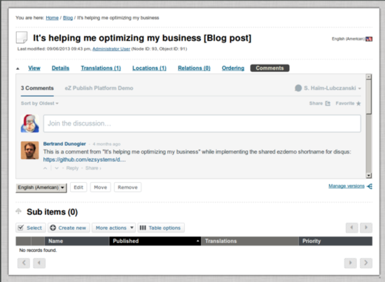
Comments
When the CommentsBundle is installed, you see the Comments tab.
The Comments are visible in the tab "Comments" of each content commentable (as defined in the ezcomments.yml file).
You can directly edit comments into the tab of the Admin Interface, if you are logged as a user who can manage (edit or delete) comments in the platform managing your comments.
Sub items
The primary purpose of this window is to reveal and sort information about nodes that are located directly below the one which is being viewed. In addition, it allows the following functionality:
- Creation of new nodes.
- Removal of existing nodes.
- Editing of existing nodes.
- Sort the sub items as you prefer.
The sorting function is dynamic and you sort by clicking the title headers of each column. The following screenshot shows the sub items window:

The Sub Items Window
(1) Select sub item
The "Select" button gives you the possibility to select the visible items in the "Sub items" list. Note that the "Select" button and the "More actions" buttons are closely related. The items you select are the items that will be affected by the actions in the "More actions" button.
You can perform the following actions:

Sub Items Selection/Deselection
(2) Create new nodes
The "Create new" button is used to create new nodes of different types. The drop-down list makes it possible to choose the type of node that will be created. This list will typically contain classes from all class groups except the "Users" and the "Setup" class groups.
In the screen below you will find a sample of the nodes you can create. Click the arrow at the bottom of the list to see more objects to create:

Create New Sub Items
The "Create new" button will start the actual creation process and thus the system will display the object edit interface. When editing is done, the newly created node will be placed at the location where the user clicked the "Create new" button. For example, if the user navigates into a folder called "International" inside another folder called "News" and creates an article, the article will be placed in the "International" folder.
Note: By clicking on the cogwheel in the sub items list you will get quick access to a context sensitive pop-up menu where you can manipulate a sub item, as shown in the screenshot below:

The Sub Items Cogwheel
(3) More actions - Move or remove sub items
In the drop down list of the "More actions" button you will be presented with the options of "Remove selected" or "Move selected". "Remove selected" will delete all selected sub items. "Move selected" will start the process of moving the selected items to a new location.

Sub Items More Actions
(4) Table options - presenting the sub items list
Under "Table options" you can decide how you wish to display your "Sub Items" list. You decide how many elements per page, either 10, 25 or 50. In the "Visible table columns" you decide which columns you wish to display in your "Sub items" list. Note the columns for "Visibility", "Node ID" and "Object ID". The "Visibility" column will show the "Hide/Unhide" status of an object.
From version 4.4 the "Content structure" tab, the "Media library" tab and the "User accounts" tab comes with different pre-defined sub items columns. By using the "Table options" dialog, users may customize what columns to show per tab or navigation part, which is stored in a browser cookie. If no cookie or ini setting is defined, the fallback mechanism is to show all columns. The fallback mechanism is to show the default columns defined by the eZ Publish admin in the "settings/admininterface.ini" file.
Please find the table with the pre-defined sub items columns below:
| Tabs/navigation area |
Columns |
| The "Content structure" tab |
Name - Visibility - Published date - Priority |
| The "Media library" tab |
Name - Visibility - Type |
| The "User accounts" |
Name - Modifier - Published |
You can modify the columns displayed in the sub items table in the "Table options":

The Sub Items Table Options
You can add or remove columns from your sub items list.
(5) Navigating the sub items list
Use the navigation buttons in the corners of the "Sub items" window to navigate in the list of children/sub items. The "prev" and "next" buttons on the upper right will display the previous page and the next page of sub items. The "first" and "prev" buttons down to the left will give you the first page and the previous of the list of sub items, and the "next" and "last" buttons will display the next page or the last page of sub items when there are several pages of sub items.Note also the pagination numbers will indicate where you are in the list and how long it is.
(6) Edit priority
If you want to edit the priorities of your sub items list, note that you can now edit directly in the priorities field. It is possible to use both negative and positive integers (zero included). The changes you make will be updated and stored directly when you push "Enter", or click on a new priorities cell. Please note that the direction of the sorting (ascending or descending) will still be controlled by clicking the triangle button next to the "Priority" title header.

Priority Editing
Balazs Halasy (07/05/2010 8:54 am)
Sarah Haïm-Lubczanski (09/06/2014 3:02 pm)
Comments
There are no comments.